Today, with CSS3, we can create interesting animations with keyframes. In this article I will explain how to create a Pacman animation step by step. Is very easy and funny.
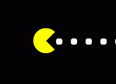
Animating Pacman
You need to split the Pacman in two vertical parts: The top part and bottom part. Take a look at this HTML example:
<div class="pacman">
  <div class="pacman-top"></div>
  <div class="pacman-bottom"></div>
</div>
The .pacman container needs a width and height. For example:
.pacman {
  width: 150px;
  height: 150px;
}
Then, both sections has the same background and the same height (50% of course). The most important difference is the border radius, which makes the original Pacman form.
.pacman > div {
background-color: #ff0;
height: 50%;
width: 100%;
position: absolute;
}.pacman-top {
top: 0;
border-radius: 100px 100px 0 0;
}
.pacman-bottom {
bottom: 0;
border-radius: 0 0 100px 100px;
}
The next step is the animation. You need to know about keyframes. The keyframes rule gives you the control of your CSS3 animations. You can define the animation step by step and name it. For example:
@keyframes spinTop {
  0% {
    transform: rotate(0deg);
  }
  50% {
    transform: rotate(-35deg);
  }
}
This animation is for the top part of the Pacman. If you want to apply the animation you need to add the animation property in the selector.
.pacman-top {
  top: 0;
  border-radius: 100px 100px 0 0;
  animation: spinTop .5s infinite linear;
}
The animation property needs the animation time (in this case 0.5 seconds), also the name (spinTop). The infinite provides unlimited repeats of the animation. The last is the speed curve of the animation (linear).
Finally, you need to add the same in the bottom part of the Pacman:
.pacman-bottom {
  bottom: 0;
  border-radius: 0 0 100px 100px;
  animation: spinBottom .5s infinite linear;
}@keyframes spinBottom {
  0% {
    transform: rotate(0deg);
  }
  50% {
    transform: rotate(35deg);
  }
}
Animating the feed
The feed appears on the right and moves to the left with an animation. Let's create the HTML code, is very easy:
<div class="dots-list">
  <div class="dot"></div>
  <div class="dot"></div>
  <div class="dot"></div>
  <div class="dot"></div>
  <div class="dot"></div>
  <div class="dot"></div>
  <div class="dot"></div>
  <div class="dot"></div>
</div>
The feed has a default style like this:
.dot {
    width: 30px;
    height: 30px;
    background-color: #FFF;
    border-radius: 30%;
    right: -30px;
}
Let's create the animation. In this case, we need the feed from the right to left. Also we need to hide it when it is inside the Pacman. Take a look at this animation:
@keyframes feed {
  0% {
    right: 0%;
  }
  90% {
    opacity: 1;
  }
  91% {
    opacity: 0;
  }
  100% {
    right: 100%;
    opacity: 0;
  }
}
The animations starts moving the feed to the left (right: 0%). Then, when the animation has 10% remaining time (for example, if the animation lenght is 10 seconds, the 90% is 9 seconds after it is started). We change the opacity to 0 to hide the element.
Finally, as the same as above, we have to add the animation to the feed.
.dot {
    width: 30px;
    height: 30px;
    background-color: #FFF;
    border-radius: 30%;
    right: -30px;
    animation: feed 8s infinite linear;
}
Another important thing is that we need to add a delay to the feed, because If we don't, all the feed starts the animation at the same time. We need a delay between animations.
Fortunately, CSS3 provides us the property animation-delay to do that. Is very simple, you only need to add the time to the property like this code:
.dot:nth-child(2) {
  animation-delay: 1s; /* 1 second for second, 2 seconds for third, etc */
}
You can see the final result here:
See the Pen Vvmjqr by Mario Araque (@MarioAraque) on CodePen.